Halloween Special!

Collecting slightly odd old photographs is a hobby of mine, so what better time to exhibit these beauties than Halloween!


Considering I'm not a big fan of horror I very much enjoyed "A History Of Horror" with Mark Gatiss which you can watch on iplayer HERE.
I'm getting into the spirit this year, I think it's a shame that Britain really can't pull off Halloween...plastic skulls and polyester witches hats from Tesco? No thanks.

Take a lesson from yesteryear;


Have a Happy Halloween everyone! I'm looking forward to a day of Pumpkin carving, and finally watching "Haxan", which should be pretty interesting! A 1920's Danish silent film based upon mental illness and medieval witch hunts? Bring it on.

Myth, Manners and Memory

Finally I managed to get to the De La Warr Pavillion to see the "Myth, Manners and Memory - Photographers of the American South" exhibition, which i had been looking forward too ever since the opening of the Brighton Biennial.

This show celebrates the American South's beauty and mystery. It has been forever mythologised in literature, art, photography and music. Think "Huckleberry Finn", Tennesee Williams poetry and The Father of Blues. Over the years, this ideal has entered the popular worldwide imagination. Who hasn't considered an American Roadtrip at some point in their lives? I know I have. I'm not ashamed to say "Elizabeth Town" is a firm favourite film of mine. Despite my own lack of travelling, I have always wanted to disappear to America and not come back until I've seen it all....so needless to say, I was VERY excited to see this show, my own dreams materialised!

Luckily, this exhibit escaped the "No Framing" rule of the festival (thank god for that) and the space looked really fantastic.

As soon as you enter the exhibit, Susan Lipper's project "Grapevine series" lurks in a darkened corner, and instantly draws you in...


Susan Lipper - Untitled, from the Grapevine series, 1988-1992

Susan Lipper is a New Yorker who spends several months every year in Grapevine Hollow, a remote rural community in the Appalachian mountains.
Through these images, you instantly become a visitor to a eerie sideshow circus. Despite many of her images being staged, Lipper's subjects are very much real. She plays with stereotypes of the American South, "Rednecks, White Trash and The Ominous Blackwoods". Think "Gummo", "The Texas Chainsaw Massacre" and Edgar Allan Poe all rolled into one terrifying neighbourhood. It's uncomfortable, but in that wonderful way that you can't tear your eyes away even if you wanted too!

Her portraits are certainly a long way from Walker Evans series just around the corner...but isn't that the point? The American South seems not to be different states as such, more overlapping narratives, all contradictory but all able to tug at our imaginations.

William Christenberry's work is exhibited in several ways, he has one wall of around 30 miniature prints from his "Dream Buildings" series, whilst on the opposite wall are larger prints, all beautifully printed. My personal favourite was "Rabbit Hutch", an image which I haven't actually seen before! It's quite shocking really, the animals fur sticks through the haphazard wire of the cage and grazes the barbed wire below. This 'DIY' aspect is something I definitely link to The South. DIY that's gone slightly wrong always tugs at my heartstrings, as it's quite close to home!


William Christenberry - Rabbit Pen, near Moundville, Alabama, 1998

William Christenberry began as a painter, and I believe that does shine through his photographic work. I find this series to be memorial, funerary portraits. The abandoned decaying buildings with the ever growing "Kudzu" plant eating everything in sight. His photographs of Southern buildings give them souls, they have roots that bind themselves into this "Southern-ness". He has taken Alabama as his muse, and is determined to examine it as deeply as he can, from the soil upwards.


William Christenberry - Palmist Building (Winter), Havana Junction, Alabama 1981

Now, we can't talk about Christenberry without talking about Walker Evans, however, (and i'm sorry to say this) I felt that Evans fell through the cracks at this show, his position within the space wasn't the best, and to be honest, it was just unexciting. I understand the images speak of the great depression of 1930's, and are therefore synonymous with the poverty and slavery that fills the history of America... but they still could have been in a more exciting, refined edit. However, one thing I will say for the images on show is they do handle the subject matter with a great dignity, Evans doesn't rob people of their image, he is respectful and duteous.


Walker Evans - "Alice Mac Burroughs" 1936

William Eggleston had some absolutely beautiful work on show, particularly his dye-transfer prints on the first wall. Eggleston also looks with an insiders eye, but his version of "The South" is definitely darker, the 'everyday-ness' of the scenes just adds to the mystery. Eudora Welty, as a southerner herself, understands this gaze:

"in dreaming long view and arresting close-up, through hours of dark and light, he sets forth what makes up our ordinary world. What is there, however strange, can be accepted without question; familiarity will be what overwhelms us."


William Eggleston - Red Ceiling, Greenwood, Mississippi, 1969-1971

After seeing his collaboration commission at the Brighton Bienniel, It was good to see some of Alec Soth's own work again! They showed a selection of his images from "Sleeping by the Mississippi" - my favourite project of his. These are just the quintessential "American Roadtrip" images. I don't think anyone has accomplished as much as Soth has in this theme, his deep relationship with both his subjects and the landscape are evident. He clearly does have a 'type' when it comes to portraits though, he certainly finds the perfect sitters in the heartland!

Soth's work has to be seen as a project. Individual images just don't portray the depth of what he does, the effort he takes. This is his journey, and the meaning gathers with every images, turning them into a poem or a great novel. I really would love to own this book! My favourite image in the exhibition was "Johnny Cash's boyhood Home", the resonance of what that tiny house means, and what it once contained, is magical.


Alec Soth - Johnny Cash's boyhood home, Dyess, Arkansas 2002

Soth portrays an American which despite experiencing important social and political change, has stayed virtually the same. The portraits seem lost in time, the landscapes are merely echoes. They are very slow images. The Mississippi river and the old plantations remain powerful.


Alec Soth - Venice, Louisiana 2002

The images by Carrie May Weems could be said to be the most political of the show, as she confronts the history of racism in American history. She physically places herself in places of resonance, dressed in a "Traditional" 1900 style gown, contrasting the barbaric truth of slavery with the refined nature of the rich families involved. Weem's is a life long work dedicated to exploring the African-American experience, however i did not find this series to be her best. It wasn't as engaging as I hoped, and actually, I think i would have preferred a single, large print, rather than a series of smaller ones. I was disappointed, as I am a fan of her projects, I just didn't find this series one of of her most visually compelling.


Carrie Mae Weems - Standing on the Tracks

You leave the exhibition satisfied. Our ideals of "The South" have been confirmed. Whatever it is that sparks our fascination is fulfilled by Soth and Christenberry's images giving us the romantic, poetic images we yearn for (probably from watching too much "Little House On The Prarie" and "Gone With The Wind") but Susan Lipper brings the morbid curiosity and stereotypes out of us in the end. It is pleasant to think that there are places in the world that can still be traditional. It's difficult to believe these places can survive somewhere as dominant and media-concious as America...

I can't wait to see it for myself. One day!

Thanks for reading!

Brighton Photo Biennial 2010 - Exhibitions

Here is the second part of my BPB blog,

"The House Of The Vernacular" is a surreal installation bringing together seven diverse collections of vernacular photography. The exhibit is at 'fabrica', a converted church, which only adds to the 'oddness' of this experience!

The first room is filled with Brazilian 'Photo Paintings' by Titus Riedl, based on the trend of painting over family portraits, the modern versions are of course done by computer manipulation, not as interesting!! The room is decorated like a Brazilian living room, with the pictures even being exhibited with printed frames around them (to agree to the Biennial 'no framing' rule). The portraits are the epitome of 'so bad, its good' and there's even a Martin Parr portrait hidden amongst the others.


Next there is an American front room featuring a projection of amateur 'American Life' snapshots, 'Archive of Modern Conflict' which i was always going to find fascinating, I'm an avid fan of anything American and Retro.

Next you enter a dead-end street in a council estate, with pictures of litter bins taken from the 'Design Council Archive' from the 1950's to the 60's plastered over the brick walls, there's even autumn leaves and litter scattered over the floor (aesthetically, this was my favourite room)


Around the back of one of the brick walls was a slideshow of 'Wirtschaftswunder' by Josef Heinrich Darchinger which he shot for the German Ministry of the interior during the cold war period. I believe that the projection was above the old alter area of the church, which provided a black shiny surface for the images to reflect upon, much like the room was filled with water, it really made the photographs look beautiful.


The fifth room was the most bizarre of all, for someone who's never flown, it was quite disorientating to find myself in the interior of a 70's plane! This was my favourite collection of images, showing the unbelievable tacky 'luxury' of African Dictators private jets taken by Nick Gleis.


Needless to say, the 'Babies and Children' portraits by Lee To Sang was my idea of hell. Lurid portraits of dolled up children covered the sickly yellow nursery walls. Absolutely terrifying, it's amazing how cruel parents can be!


The location of this exhibited enables it to be the most exciting adventurous show of the entire Biennial, it's not something i would usually enjoy (with it being so OTT) but as it's Brighton, they got away with it!

My favourite body of work from the Biennial was Alejandro Chaskielberg's "The High Tide" which was exhibited at The University of Brighton Gallery. At first glance, i was worried that the entire exhibit was on small prints, luckily, only a few were printed a smaller size. However, i would say that the curatorial decision to print everything digital severely affected this work, considering they had been shot on 5x4, naturally c-types would have brought out their vibrancy and detail so much more successfully. Sadly, he had to follow the rules, which mean the colours suffered.

By lighting his photographs with a full moon (and only a touch of flash), and his use of shift focus, Chaskielberg creates a cinematic and deeply atmospheric feel to his portraits. His use of the figures within the overpowering natural landscape is similar to the idea behind my project 'Thrive', if only i had captured the magic he has!

There are certain patches of coloured light which are almost ethereal, I can't imagine how he created such vibrancy whilst being in the centre of such overbearing surroundings! Dragging a 5x4 camera through jungle is certainly an achievement!

An absolutely fascinating body of work.


"New ways of Looking" at the former Co-op Department store featured several of my favourite photographers, in an environment i'd describe, at best, as 'unsafe'. Asbestos anyone?

Regardless of this, some of the work actually worked brilliantly with the building! To see Viviane Sassen's "Flamboya" in the flesh was wonderful (despite the digital prints not showing them to their full vibrancy!) The effect this series have is truly captivating. Any children at the show made a beeline for this work, constantly asking questions such as "why does he have paint on him?" "why is she hiding in that tree?" etc etc...one child even GRABBED one of the prints...made me feel quite ill. But yes, utterly beautiful work that is currently being imitated by many 'fashion' photographers out there...to no avail.

It was good to see Dhruv Malhotra's "Sleepers" and Suzanne Opton's "120 days in Afghanistan" but for me, both were lacking in something...or perhapes were just incorporating too many prints...or were just shown in a too-small space...it was hard to decide. The less said about Ju Duoqi's "The Fantasy of Chinese Cabbage" the better...

I was utterly blown away by Wout Berger's "Big Bend Badlands", this was one project which the printing and presentation worked in it's favour. He exhibited around 10 large scale, extremely detailed images of terrain, scrubland and landscape. Basically, everything i love! I found i could get utterly lost in these prints, due to their impressive size, practically wall to ceiling! I would love to see some of his images exhibited his own way very soon, he's definitely a new inspiration for me.


Upstairs, i very much enjoyed "The Anachronistic Album" by Laura Braun, Heather McDonough and Melanie Stidolph. They had collected together excerpts from their own work alongside family photographs, tracing sensibilities and subject concerns through cultural and family ties. The work is partly inspired by Geoff Dyers book "The Ongoing Moment" (which i need to read very soon). I just found this work to be totally unpretentious, honest and caring. Some of the images were utterly fascinating, and i found the placement of the images very enjoyable to walk through, it was a glorious family tree, threads of memory and emotion (basically, EVERYTHING i love).


My last stop was at my past lecturer Jason Evans show "Nothing is in the Place" which was in the basement of the dilapidated Co-op building. His wonderful curation meant the show looked brilliant in such an environment, and I spent nearly an hour wandering the stream of images that were remembering life in 1990's Britain. The chosen images portray the time of unrest and upheaval, mixed with the iconic youth culture and music scene. It is truly exciting show, beautiful photographs from Vinca Petersen, Paul Seawright, Nigel Shafran and Helen Sear all provide evidence of why 90's British photography was just so wonderful, the beauty in the restless and the mundane.


FINALLY, the "Strange&Familiar" show at Brighton Museum featuring Stephen Gill, Rinko Kawauchi and Alec Soth, for me, Stephen Gill's felt the most 'together'...it's hard to explain, but his prints looked great together, combine this with a trophy table full of the objects that he collected arranged in anatomical precision, and it's instantly a hit for me!

Alec Soth
's room looked great too, the choice to print a few chosen images on pink paper instead of white really gave the work a happy, 'full of life' feel...He even featured "The Brighton Bunny Boy" at the very end! I also thought his was the nicest book of the three.

Rinko Kawauchi's work was split amongst two rooms, separating the starling photographs from the people photographs, which was an interesting choice that worked well. I particularly liked the 'jogger' photograph in the second room. However, she confided to Thom that she would exhibit it very different if she showed it again, which i'm sure would show off the work to it's full potential if done HER way! The size of the images was perfect, but I was very sad to see that my favourite image of the "ghostly seagull" wasn't featured!

This exhibition was absolutely PACKED though, so I would love to have had a better look around!

I was very sad to discover that "Myths, Manners and Memory" isn't actually IN Brighton?!? So that's the next trip! I can't pass up an opportunity to see William Christenberry prints in the flesh!

So all in all, i had a very enjoyable and educational BPB. It was an absolute joy to see Viviane Sassen's work in the flesh, and i am left utterly inspired by "The High Tide" and "Big Bend Badlands". This was a harsh reminder that i haven't been taking many photographs recently...i need to address this ASAP. At least i have some new inspiration!
For me, the choice of digital prints and no framing did dampen things slightly, but I understand the funding issues they were up against.

Now it's time to head over to the east London Photo Festival!
Fashion week?? Pfffffffffft, it's all about Photo month! Get it right!

Thanks for reading!

Brighton Photo Biennial 2010 - In conversation with...

Finally I've managed to bring myself to blog about BPB!

Well, it began, and it ended, with rain. Torrential rain. Luckily, the excitement of all the shows kept our spirits up!

So Friday morning Myself, Andrew Bruce, Thom Bridge and Helen Goodin attended the opening talk of BPB. The first half was a conversation with Helen Cadwallader (Executive Director of BPB) and Martin Parr. One of the first points i noted was how Martin said he wanted everything in the show to be "new", but he needed to get "the names" (ie. more famous photographers involved) rather than just the "new kids on the block". Now, i found it hilarious that he regarded Alec Soth, Rinko Kawauchi and Stephen Gill to be these "new kids"! I thought we were the "new kids on the block"? Oh well...

In classic 'Parr' fashion, he then proclaimed how "photography is so predictable", and how certain rules regarding contemporary photography have sprung up, and yet, how there is constantly a habit of looking nostalgicaly at the past too. He seemed scornful of how the history of photography has been written "by academics sat behind a desk" and is pleased that "photobooks are creating a new history".

He then made the controversial statement that Photographers can be better at spotting 'good' work than professional curators! This caused a bit of an uproar, as i'm sure there were several successful curators sat right in front of him! However, i can understand what he meant by this, and i didn't think he needed to retract this statement to keep people happy! After all, Martin Parr was bound to say photographers are better at it, considering he IS the curator of BPB, it was just some good self promotion!

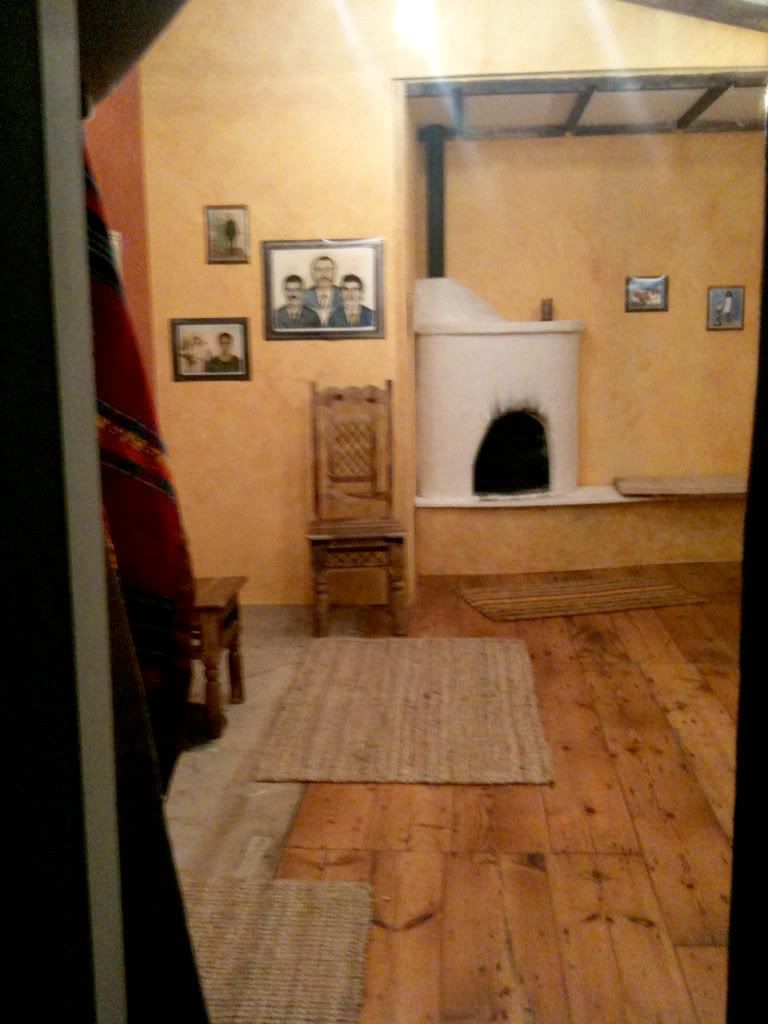
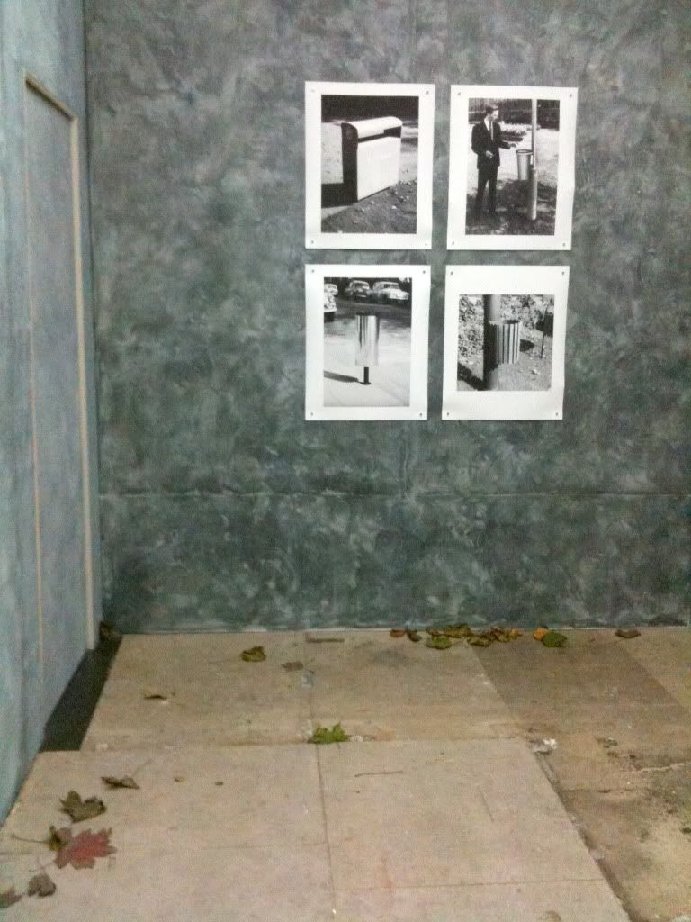
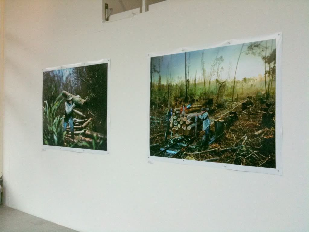
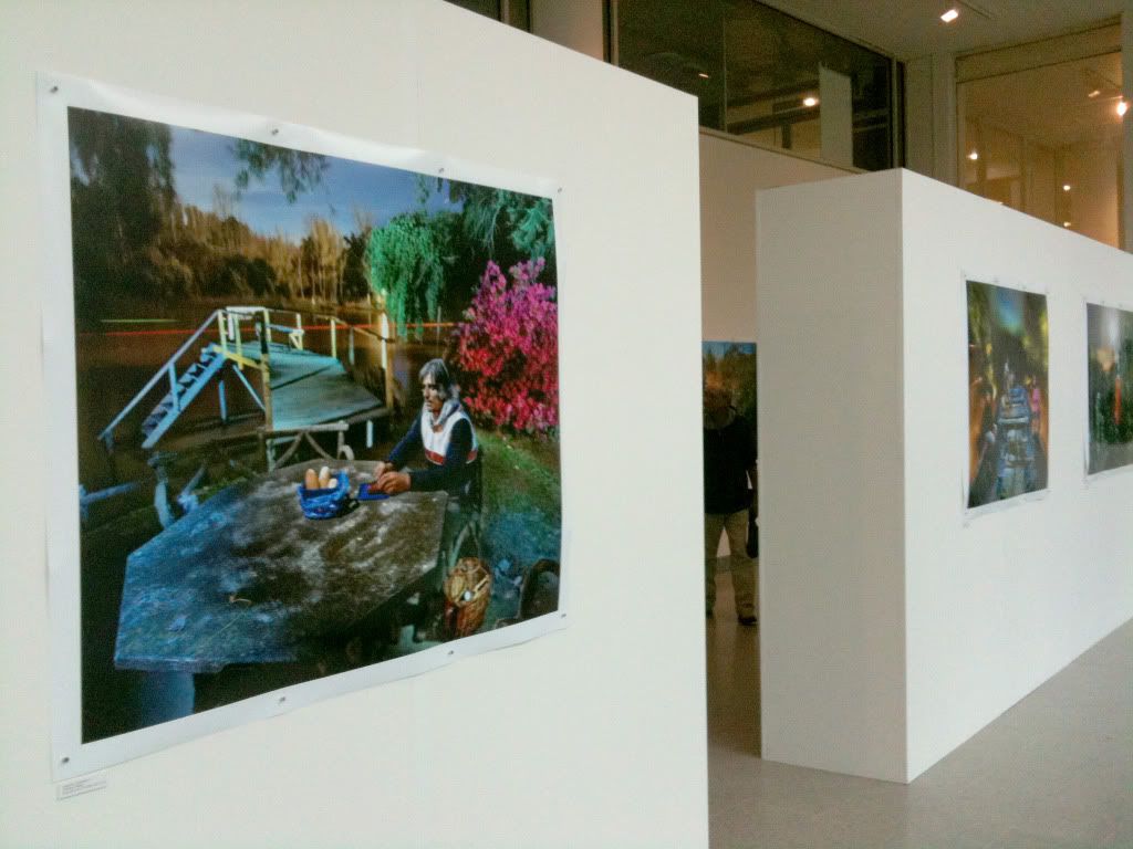
Now, the most talked about issue of the Biennial, was the choice to use digital printing, and absolutely NO framing for any of the featured shows. Now, stupidly, i was unaware of this curatorial decision until this talk, so it took me by surprise (to say the least!) I understand that times for the arts right now are VERY tough, but goodness, if the biggest photo festival in the UK is under pressure, heaven help the rest of us! When witnessing the presentation at the shows, it really was hit and miss (more about that later!) Another reasoning behind this choice was the the work remaining frame-free shows something 'vibrant and exciting', plus at the end, if the artist's don't want them back, they can just be ripped up (when he said this, a tear came to my eye!)

His next question referred to the "Queer Brighton" exhibition, and the process he took in choosing the two photographers for this project. Now, this was the only show at BPB that i found underwhelming and lack-lustre. I won't get into too much of a rant, but I just found the method of choosing the photographers crass and unnecessary, basically it's a question of "do you need to be a gay photographer to photograph the LGBT community?" They would seem to say yes, I, however would disagree. Surely, a photographer who can build a strong bond with a community, and portray an insightful and interesting approach is the only necessity? Why should this project brief be so excluding, particularly when relating to a place as open as Brighton? But as I say, I will cut the rant off here...

RIGHT, on with the artist talks!

First up was Stephen Gill, a photographer i have followed and admired for a long long time (and i was lucky enough to receive his "Hackey Rag" publication as an anniversary present last month, hooray!)

Stephen seems like the nicest guy you could ever bump into! His project "Outside In" represents his keenness to explore a place he had never experienced before, as i mention, Stephens work mainly revolves around Hackney! However, he relished the chance to "take a step back and let the spirit of the town guide him"...sounds nice to me! He walked around Brighton collecting things of interest, from crabs to flowers to jewellery to feathers. He then placed these objects into his camera, so his images literately absorbed the location, and kept this sense of exploration and discovery. He describes this process as "Half Steering" the images, as it released him of the usual control, he compared this feeling to "wringing out a towel", or "hoovering up" this environment. He even went as far as dunking the camera in the sea! (Note: he admits he went through several camera's with this approach! So proceed with caution!)
My favourite example of this process was when he described "catching a fish, eating the fish and then putting the bones in the camera!"

The end result is quite fascinating! The pictures now 'lack' information, but in a way that they've chosen to turn information down...this allows other ideas and readings to creep into mind, and become apparent.

He is playing on the fact that we see our cameras as such precious things, and how we let them be in charge most of the time, this project certainly turns that notion around! More about his exhibition presentation in the next post!


Next to speak was Rinko Kawauchi, one of my favourite photographers who i was lucky enough to meet at the talk, as our good friend Shiho Kito is her assistant and kindly introduced us! It made my weekend.

Her project "Murmuration" documents the flocks of starlings flying over Brighton, and comparing to this, the flocks of people on the streets during the springtime. Rinko said after initially seeing the birds, she went and researched the movement and behaviour of Starlings, "It's said that they fly in such groups to protect themselves and to hunt food. But of course, to know for sure, we'd have to ask the birds themselves!"

When photographing the people, she took a "god like" view point, and shot the images from the top deck of a bus. This enabled her existence to almost disappear, she became invisible.

Her underlying intention of this work is the question "Why do we live on this earth?" and "why do we behave in this manner?". Surely, this is the very notion of Photography, exploring our environment and what it means...we communicate through our photographs, which is excellent as there is no language barrier!

She used digital for the first time on this project, and despite it being "better than she expected", she confided in Thom later that evening that she would present the work differently if exhibiting it again. There were two images that really jumped out at me, the first is the largest print of the massive flock of birds flying over the sea in a fish-like shape, become like a liquid shape shifting phenomena, and the second was an image only in the book, of a single ghostly white seagull against black clouds and raindrops .


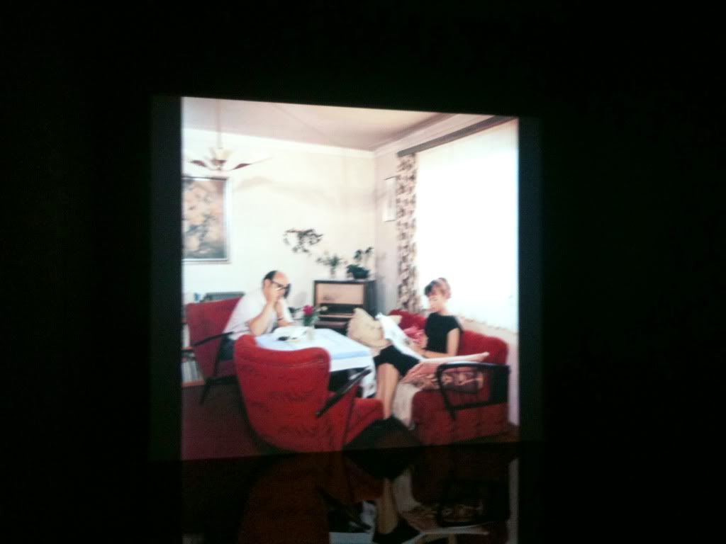
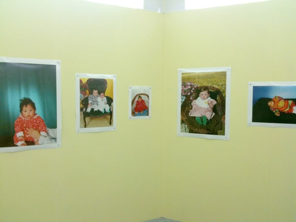
Alec Soth was the last to speak about his project, which as i'm sure we all know, became a collaboration between him and his daughter after he was denied a work visa. Now, i actually didn't have high expectation for this work, as (due to my irrational fear of children) found the father-daughter project proposal too twee and "cutesy". HOWEVER, i was proved very wrong, as this project is bloody brilliant!

The first slide he showed was a headline of the local Brighton Newspaper The Argus "Mysterious girls in punch-up at Peter Andre Show"...I'm so sorry that this was one of the first things to welcome them to Brighton!!

Alec's a great speaker, very laid back, very honest, and very modest too! The first point he wanted to make is that we must all realise that "accidents are good!"

This whole project was one big accident. However, they overcame the obstacles and created a really wonderful body of work, that depicts Brighton perfectly! I am a very big believer in "Wanderlust", and this project is a perfect example of how effective just walking and exploring can be. It's a collaboration, She took all the images herself (Alec sometimes tried to make suggestions, but they never looked as good as her own decisions!) and he edited the photographs for her.

After a few days, he decided to make a list for their "walk-by's" so she wouldn't get bored, they looked for thing such as "Bunnys, Bread, Red Hair, Flowers, Garbage" basicaly, all the BEST things in life, and made it into a game.

It's an unpretentious, joyous body of work! In one of the images, Alec is lurking in the top corner of the photograph...is the photo of him? Or was she trying to hide him? Who knows. But a handwritten "Daddy" and an arrow points him out on the print anyway!

Utterly hilarious. Alec Soth the photographer who brought us the stunning, innovative "Dog Days.." and "Sleeping by the Mississippi", the renowned Magnum Photographer, just becomes "daddy ->". It's Genius.

"Daddy" is the key. It makes it accessible to all! The barrier is broken down, and he is obviously so proud of his daughter. It must have been a wonderful for both of them, a unique bonding experience. I think it's great he was encouraging us to not patronise or "dumb down" photography and art to children, and how he wanted to encourage children to come and critique the exhibition!

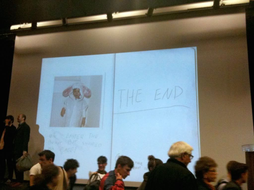
Just when i thought i couldn't like this man more, he suddenly shared with us the photo-project he collaborated with his son AND daughter whilst on the trip "The Brighton Bunny Boy", a mix of photographs, drawings and story telling that had me and Thom crying with laughter and bemusement!! With lines such as "But aren't you freaked out??" "No, you're a sweet Bunny Boy", you get the picture! This side project allowed him to indulge in his interest in storytelling, whether you need images AND text or just image.

Throughout the talk, Soth quoted Eggleston "If you can photograph everything, how can a photograph have meaning?" which becomes very interesting when put into context with this project, as these images are non self-consciousness from a non-photographer, a child.
Does this give them MORE meaning?
This all relates to children's characters, their interest in the world and their unique viewpoint.

As adults, do we relate to this for it's nostalgic qualities rather than it being a "different" approach to our own?

After all, Children seem enthusiastic about everything! They can find magic.

Photographers share this quality, they are naturally curious, therefore, it's a natural approach to use.


That's the longest post ever. I apologise and hope some of that was a good read!! Next post about he shows coming right up!

Thanks!